
Concert Poster / Gig Poster
Best for:
Event postersSocial media announcementsPrint artBand merchandiseFestival brandingWall art
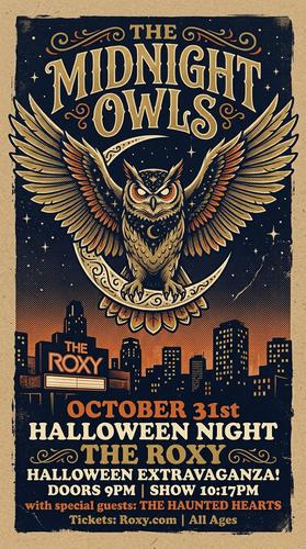
Sample prompt used to generate the hero image
Screen-printed concert poster illustration for a fictional band called "The Midnight Owls" playing at "The Roxy" on October 31st, 9:16 vertical format. A giant spectral owl with spread wings perches atop a crescent moon over a city skyline silhouette. Limited 4-color screen print — midnight navy, burnt orange, cream, and metallic gold on kraft paper stock. Visible screen-print texture: halftone dots in gradients, slight ink bleed at edges, and paper fiber visible through transparent ink layers. Bold hand-drawn serif typography with the band name arching over the owl. Inspired by the Fillmore poster tradition.Prompt Variations
Section titled “Prompt Variations”Screen-printed concert poster for [BAND NAME] playing at [VENUE] on [DATE], 9:16 vertical format. [CENTRAL IMAGERY — e.g., a massive kraken rising from the sea, tentacles wrapping around a lighthouse]. Limited [N]-color screen print — [COLORS — e.g., deep teal, rust red, cream, and black] on [PAPER — e.g., cream cotton paper]. Visible screen-print texture: halftone dots in gradients, slight ink bleed at edges, paper fiber visible through transparent ink layers. Bold hand-drawn [TYPOGRAPHY STYLE — e.g., Art Nouveau serif] lettering with the band name as the dominant element. [SUPPORT ACTS / DETAILS] in smaller type at the bottom.Screen-printed festival poster for "[FESTIVAL NAME]" featuring [NUMBER] acts, 9:16 vertical format. [CENTRAL IMAGERY — e.g., a massive sun with radiating beams over a desert landscape with silhouetted festival tents]. Limited 5-color screen print — [COLORS] on [PAPER]. Halftone dots, ink bleed, paper texture. Multiple bands/artists listed in decreasing font sizes — headline act at the top in large hand-drawn type, support acts in progressively smaller lettering below. Festival dates, location, and ticket info at the bottom. Collectible art-poster aesthetic.Minimalist screen-printed gig poster for [BAND NAME] at [VENUE], 9:16 vertical format. [CENTRAL IMAGERY — e.g., a single bold geometric shape — a circle subdivided into four quadrants with a tiny silhouette figure in one quadrant]. Limited 2-color screen print — [COLORS — e.g., neon pink and black] on white paper. Large areas of negative space. Halftone dot gradients where the two colors overlap. Clean, modern sans-serif typography. The design could work as a fine art print independent of the event.Vintage-style screen-printed poster for a fictional [ERA — e.g., 1960s] concert: "[BAND NAME]" at [VENUE], 9:16 vertical format. [IMAGERY — e.g., a stylized electric guitar bursting with radiating sound waves]. Limited 4-color screen print — [COLORS — e.g., burnt orange, olive green, cream, and chocolate brown] on aged kraft paper with visible foxing and edge wear. Hand-drawn psychedelic or woodcut-style typography. The poster looks like an authentic vintage find — slightly faded ink, paper aging. Fillmore / Avalon Ballroom era aesthetic.Screen-printed event poster for [EVENT — e.g., a craft beer festival / book fair / film screening / food market], 9:16 vertical format. [CENTRAL IMAGERY — e.g., an oversized pint glass overflowing with stylized hops and barley sheaves]. Limited 4-color screen print — [COLORS] on [PAPER]. Visible halftone dots, ink bleed, paper fiber through transparent layers. Hand-drawn typography with the event name prominent. Date, location, and details in supporting text. Artisan, handmade aesthetic.Create a screen-printed concert poster for [BAND NAME] at [VENUE] on [DATE]. [CENTRAL IMAGERY]. Limited [N]-color screen print — [COLORS] on [PAPER]. Halftone dots, ink bleed, paper texture. Bold hand-drawn typography. 2:3 vertical format.Create a screen-printed festival poster for "[FESTIVAL NAME]." [IMAGERY]. Limited 5-color print — [COLORS] on [PAPER]. Multiple acts listed in decreasing font sizes. Halftone texture. Collectible art-poster aesthetic. 2:3 vertical format.Create a minimalist screen-printed gig poster for [BAND NAME] at [VENUE]. [SIMPLE IMAGERY]. Limited 2-color print — [COLORS]. Large negative space. Halftone gradients. Clean modern typography. 2:3 vertical format.Screen-printed concert poster, [BAND NAME] at [VENUE], [IMAGERY], limited [N]-color print [COLORS] on [PAPER], halftone dots, ink bleed, hand-drawn typography --ar 11:17Vintage screen-printed concert poster, [ERA], [IMAGERY], limited [COLORS] on aged kraft paper, psychedelic typography, Fillmore era aesthetic, faded ink --ar 11:17Minimalist screen-printed gig poster, [IMAGERY], 2-color print [COLORS], large negative space, halftone overlaps, clean sans-serif typography --ar 11:17Screen-printed concert poster, [BAND NAME], [IMAGERY], limited [COLORS] on [PAPER], halftone dot gradients, ink bleed, bold hand-drawn typography, silkscreen artNegative Prompt
photograph, digital, smooth gradients, clean edges, full colorScreen-printed festival poster, [IMAGERY], limited 5-color print, halftone dots, ink bleed, multiple band listing, collectible art posterNegative Prompt
photograph, digital, smooth, clean, full color spectrumImage-to-Image Transformations
Section titled “Image-to-Image Transformations”Using the attached photo as reference, transform it into a screen-printed concert poster for [BAND/EVENT]. Reduce the color palette to [N] colors — [COLORS] — on [PAPER]. Apply screen-print texture: halftone dots in gradient areas, ink bleed at edges, paper fiber visible through transparent ink. Simplify the composition to a bold, graphic statement. Add hand-drawn typography reading "[BAND NAME]" at the top and "[VENUE] · [DATE]" at the bottom.[Upload Photo] "Transform this into a screen-printed concert poster. Reduce to [N] colors — [COLORS] on [PAPER]. Add halftone dots and ink bleed texture. Bold graphic composition. Hand-drawn typography for [BAND NAME]."[IMAGE_URL] Screen-printed concert poster, limited [COLORS], halftone dots, ink bleed, hand-drawn typography, silkscreen aesthetic --iw 1.5 --ar 11:17Tips & Best Practices
Section titled “Tips & Best Practices”- Limit the palette strictly: “Limited 4-color screen print” is more effective than naming colors alone. Real screen printing is limited by physical ink layers.
- Paper stock matters: “Kraft paper,” “cream cotton,” “newsprint” — the paper shows through transparent ink areas and dramatically affects the look.
- Halftone is the texture: “Halftone dots in gradient areas” creates the physical printing feel. Without this, it looks like a flat digital illustration.
- Typography IS the design: Concert posters live and die by their lettering. Specify the style: “hand-drawn psychedelic,” “bold condensed sans-serif,” “Art Nouveau display.”
- Common pitfalls: “Poster” alone is too generic. Always specify “screen-printed” and name the ink count. Don’t use photographic language — this is graphic illustration.
- Pairs well with: Vinyl Album Cover (same music art tradition, square vs. vertical), Soviet Constructivist (similar bold graphics, limited palette)